ShopDreamUp AI ArtDreamUp
Deviation Actions
Lately, someone on this site has started learning to use Photoshop. She uploaded a piece, and it looked like a traditional artwork piece to me (until she told me it was digital). However, she said she had no idea what she was doing (using curse words and such), which got me a bit concerned for her transition to digital art. And since I'm using Photoshop myself, I decided to give her some pointers and recommended the best possible tools to use for creating some art piece.
--
Seeing how I made a HUGE comment, I decided that maybe it would work best as a journal for anyone learning to use Photoshop. So I decided to copy my comment and display it here as a journal, for anyone who is new to Photoshop to read and learn from to make their Photoshop uses better and easier.
--
So, down below are my recommended tools to use when making some art on Photoshop:
BRUSH AND ERASE TOOLS AND SIZE
First, there is brush and erase tools. You can control their sizes by clicking either "[" or "]" on the keyboard.
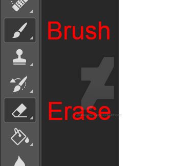
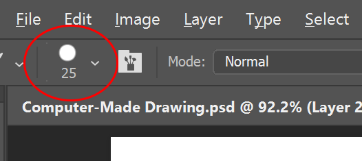
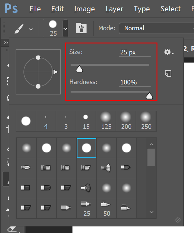
Near the top of the page, under "File", "Edit" and those other tabs, are the options to help control the tool you're using. You might see some circle with a number below it. Click on the arrow and it will show you some more options; you can control the softness or hardness of the tool edges and the size.
--
LAYERS
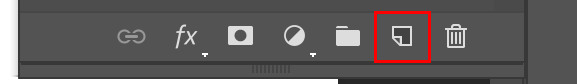
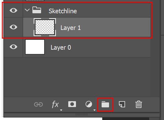
One thing that could help you out is the "Layers" button. You can add multiple layers to draw over certain things that you don't want changed (just be sure you're on the layer you want to paint on so you don't mess up a layer you already think is perfect). Just click on this button at the bottom of the Layers window that looks like a square with a folded edge (next to the trashcan icon) to add a layer.
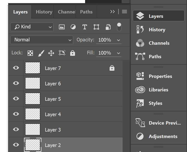
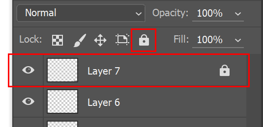
If you already have a perfected something painted on one certain layer and are afraid to affect it in any way, you can lock that layer by clicking on the icon that looks like a lock on the tab that says, "Lock". This way, you cannot move or affect that layer. To unlock it, just click the lock again.
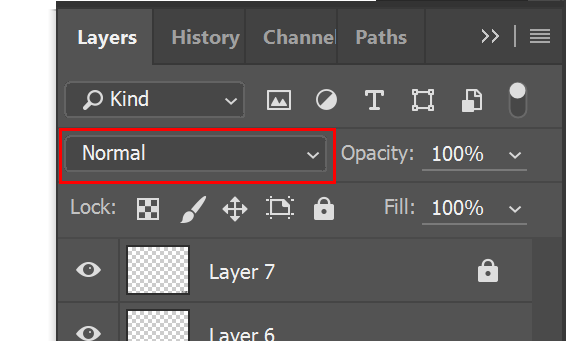
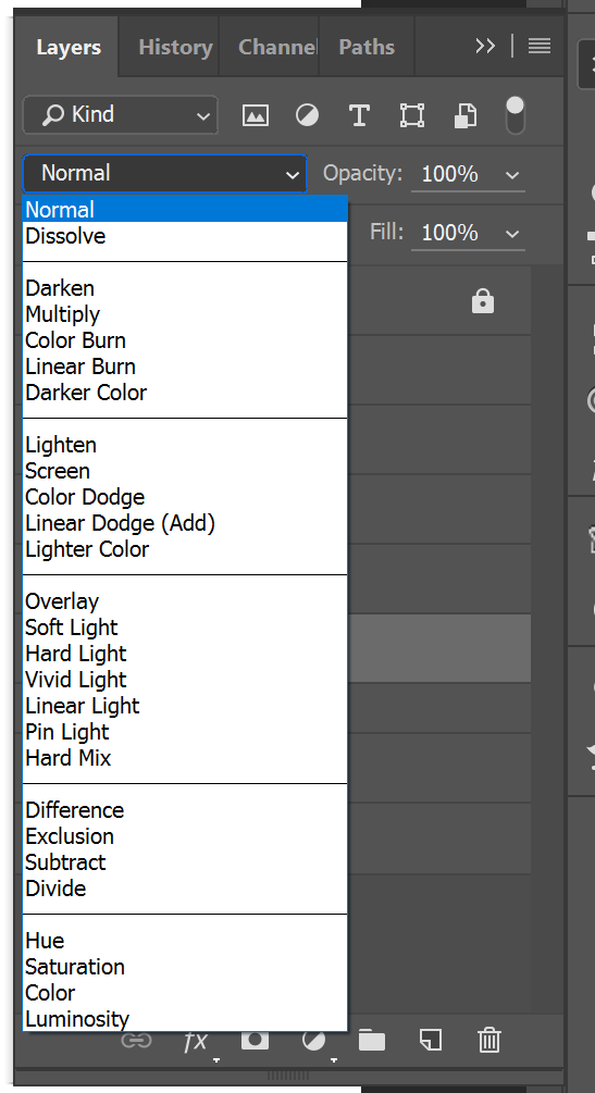
Also, on the Layers settings, under the word "Kind", you may find this tab that says "Normal". This tab shows many multiple effects for the layer you're on, which would affect the layer from below the layer you're on (if you have anything below it that's a different color). Play around with it. Paint something on some layer, add another layer, paint something random, and play around with the "Normal" tab options to see how it affects the layer below. It might give you some ideas.
Also, there comes a moment when you feel like you have one-too-many layers to keep track of. That's okay; you can group them in a folder so that they will be easier to keep track of and access. Just select one or more layers, and then click on the Folder icon at the bottom of the Layers window (two buttons left of the trash can), and your layers will automatically be kept in that folder. You can then click on the folder layer itself to either open or close the group of layers. You can also add folders within folders by selecting the group itself and then clicking the folder icon. Just don't forget to name your layers/folders so you keep track of what you're working on without making mistakes on different layers.
--
PAINT BUCKET
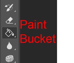
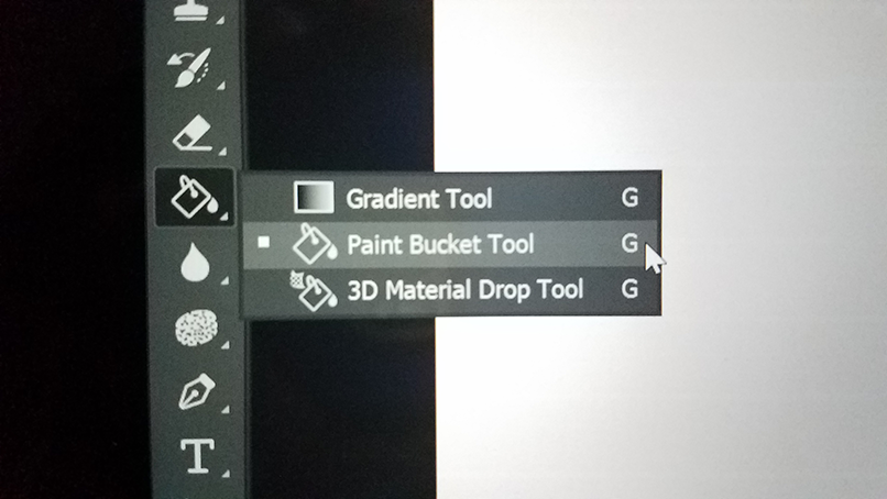
There's the traditional Paint Bucket tool, which quickly fills up any space you wanna color immediately. Click "G" to access it quickly (and make sure it looks like a bucket, not a gradient rectangle).
 (I couldn't printscreen when the menu was available)
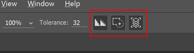
This tool is a tad bit tricky as there are several options to make it work the way you want it to. On the bar near the very top of the program, there are these three buttons: one looks like a staircase, one is a rectangle with a circle being added, and the other looks like a stack of papers.
Of course, this is for the newer version(s) of Photoshop. For those who use older versions, they look like this:
 "Anti-alias", "Contiguous", and "All Layers".

Staircase: Anti-Alias. You know how annoying it gets when the edges are pixelated, right? With this selected, your paint bucket tries its best to smoothly fill in any space it's enclosed in, making the edges of the fill smooth. For example, you have an outline you wanna fill in, and with this selected, the bucket will fill in the outline neatly (albeit leaving a bit of transparency on the edges, but at least it won't look so pixelated).

Rectangle with circle: Contiguous. This means that if your paint color exactly or closely resembles any other color you're painting over, it will connect to that color and fill it in as well, "adding" to that color. For example, you have an area painted red. You wanna fill in this other area with red. When both areas connect the more you paint, they will touch each other, and the more you paint, the other red area will gain more paint as well. Or if you have a very hot pink, it might connect to the red area as well and think of it as a close red.

Stack of papers: All Layers. This is perhaps the most important, because if you have this deselected, if you try to fill something in, the entire layer you're on will fill with that one color. By clicking this, the paint will only be limited to a certain area, such as an outline you wanna fill in. Think of this as a "wall" to help enclose whatever you wanna paint so that the paint doesn't go outside to the rest of the layer.
I recommend having ALL these buttons selected. It will make the paint bucket easier to use.
And to the left of these buttons is this one thing called "Tolerance".
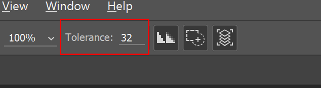
I think you might already know what this means, but I'll just explain for the sake of it. It shows how strong your paint bucket is. The lower the number, the weaker the paint bucket is and will only fill in little by little. The higher the number is, the stronger the paint bucket is and will fill up more.
Another thing I should mention is, if you feel like filling in an outline you draw, I recommend having the outline on one layer, and filling in the outline from a bottom layer. This way, you will keep the outlines clean and clear on the top. If you paint ON the outline, the paint may cover up the outline the more you paint. Painting below the outline will keep the outline clear, clean, and visible.
And, hey, this way, if you want to create some art without the outline being seen, you can paint under the outline, and then remove the outline layer itself (by clicking on the eye icon on the layer), leaving only the painted part, and you can work on the rest! (Wink)")
--
FILTER TAB
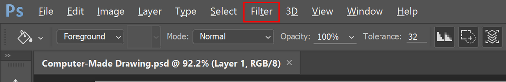
Then there's the "Filter" tab at the top of the program.
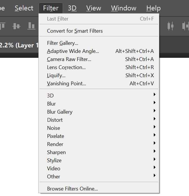
It has a bunch of effects on the list, such as Blur, Distort, Pixelate, Sharpen, Noise, etc. Play around with those. You'll find them fun and useful.
You can also click on the Liquify tool on the "Filter" tab. You can play around with that to mess with your layers and such. It's all about messing around with the options to achieve whatever you wanna draw.
--
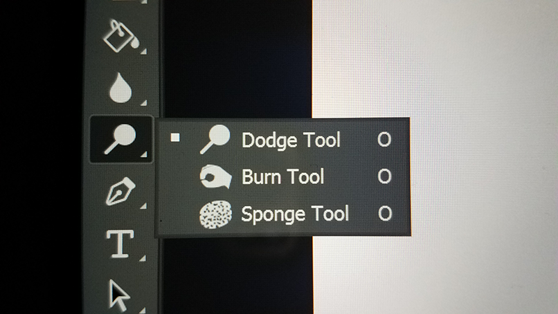
DODGE, BURN, SPONGE TOOLS
On the main tools where you find the brush, there are these tools called "Dodge", "Burn", and "Sponge". Click "O" in order to access them quickly. You'll find them pretty useful for when you wanna do some lighting and shading (if you don't use the layers effects).
 (again, couldn't printscreen the menu)
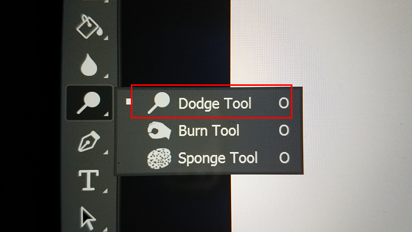
The Dodge tool, when used on an image, brightens up wherever you click. Just like with the brush and erase tools, you can control the softness and size of the tool towards the top of the program, with the circle with a number below it.
Then next to it is something that says "Range".
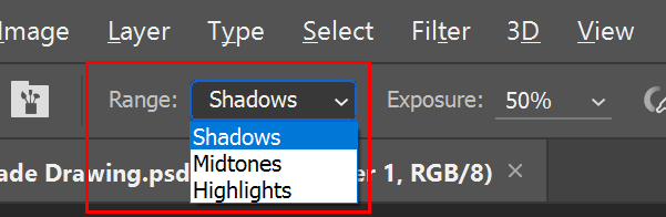
This controls whatever the brightness affects most in the image. There are three options: "Shadows", "Midtones", and "Highlights". So if you're using the Dodge tool on any image, if you have "Highlights" selected, it will affect the brightest parts of the image, and they will become brighter pretty quickly. Even the darkest areas, as long as they're not pitch black, will gain some brightness slowly as well. "Midtones": pretty much in the middle of light and dark. Again, pitch black might not be affected. "Shadows": pretty much the darkest parts of the image AND pitch black will become brighter, as well as the light parts, only they won't become as colorful.
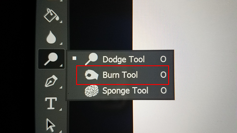
Same goes for the Burn tool, which darkens things. "Highlight": darken the brightest parts of an image, only they will turn rather gray-ish when darkened. "Midtones": the middle of light and dark will become slightly darker (or it might turn the colors warmer with more contrast). "Shadows": the darkest parts of the image will become incredibly dark. It might also affect some of the lightest colors when they're not pitch white.
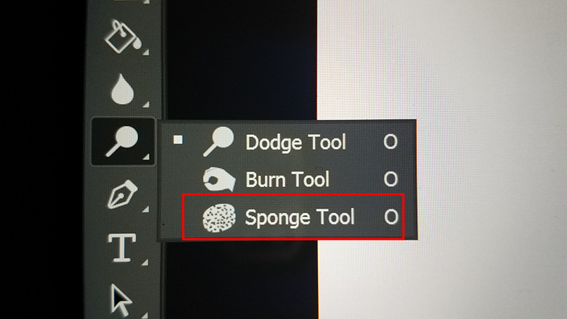
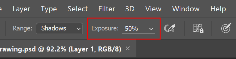
Sponge tool: that either adds or takes away color. At the top of the program, below the File and Edit bar, there's this bar that says "Mode" with two options: "Saturate" and "Desaturate". Saturate adds color, and Desaturate takes away color.
And for all these tools, there's this other option to the right of the Range/Mode bar called "Exposure" ("Flow" if you use the Sponge tool), which controls how strong or light you want to use the tool. So if you don't want too much brightness/darkness/color taken away or added, you can control the Flow so you can lightly control the effects.
--
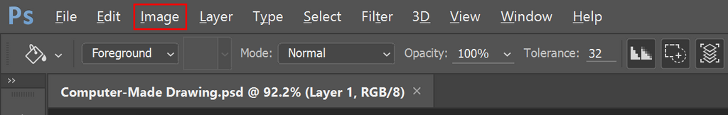
IMAGE TAB
And of course, at the top bar at the top of the program is the "Image" button for editing color and brightness in general.
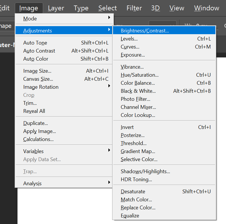
You can either edit one image or just one layer for an image. Edit the brightness and contrast in general, and you can also edit the color with the "Hue/Saturation". Then there's also the "Color Balance" on the list to play around with the lighting and shading colors of an image.
--
This is all I have for now. I will add more images to the journal later to help with the visual examples.
If you wanna learn a bit more, feel free to ask me, I will help you (when I have the time to do so).
--
Seeing how I made a HUGE comment, I decided that maybe it would work best as a journal for anyone learning to use Photoshop. So I decided to copy my comment and display it here as a journal, for anyone who is new to Photoshop to read and learn from to make their Photoshop uses better and easier.
--
So, down below are my recommended tools to use when making some art on Photoshop:
BRUSH AND ERASE TOOLS AND SIZE
First, there is brush and erase tools. You can control their sizes by clicking either "[" or "]" on the keyboard.
Near the top of the page, under "File", "Edit" and those other tabs, are the options to help control the tool you're using. You might see some circle with a number below it. Click on the arrow and it will show you some more options; you can control the softness or hardness of the tool edges and the size.
--
LAYERS
One thing that could help you out is the "Layers" button. You can add multiple layers to draw over certain things that you don't want changed (just be sure you're on the layer you want to paint on so you don't mess up a layer you already think is perfect). Just click on this button at the bottom of the Layers window that looks like a square with a folded edge (next to the trashcan icon) to add a layer.
If you already have a perfected something painted on one certain layer and are afraid to affect it in any way, you can lock that layer by clicking on the icon that looks like a lock on the tab that says, "Lock". This way, you cannot move or affect that layer. To unlock it, just click the lock again.
Also, on the Layers settings, under the word "Kind", you may find this tab that says "Normal". This tab shows many multiple effects for the layer you're on, which would affect the layer from below the layer you're on (if you have anything below it that's a different color). Play around with it. Paint something on some layer, add another layer, paint something random, and play around with the "Normal" tab options to see how it affects the layer below. It might give you some ideas.
Also, there comes a moment when you feel like you have one-too-many layers to keep track of. That's okay; you can group them in a folder so that they will be easier to keep track of and access. Just select one or more layers, and then click on the Folder icon at the bottom of the Layers window (two buttons left of the trash can), and your layers will automatically be kept in that folder. You can then click on the folder layer itself to either open or close the group of layers. You can also add folders within folders by selecting the group itself and then clicking the folder icon. Just don't forget to name your layers/folders so you keep track of what you're working on without making mistakes on different layers.
--
PAINT BUCKET
There's the traditional Paint Bucket tool, which quickly fills up any space you wanna color immediately. Click "G" to access it quickly (and make sure it looks like a bucket, not a gradient rectangle).
(I couldn't printscreen when the menu was available)This tool is a tad bit tricky as there are several options to make it work the way you want it to. On the bar near the very top of the program, there are these three buttons: one looks like a staircase, one is a rectangle with a circle being added, and the other looks like a stack of papers.
Of course, this is for the newer version(s) of Photoshop. For those who use older versions, they look like this:
"Anti-alias", "Contiguous", and "All Layers".Staircase: Anti-Alias. You know how annoying it gets when the edges are pixelated, right? With this selected, your paint bucket tries its best to smoothly fill in any space it's enclosed in, making the edges of the fill smooth. For example, you have an outline you wanna fill in, and with this selected, the bucket will fill in the outline neatly (albeit leaving a bit of transparency on the edges, but at least it won't look so pixelated).
Rectangle with circle: Contiguous. This means that if your paint color exactly or closely resembles any other color you're painting over, it will connect to that color and fill it in as well, "adding" to that color. For example, you have an area painted red. You wanna fill in this other area with red. When both areas connect the more you paint, they will touch each other, and the more you paint, the other red area will gain more paint as well. Or if you have a very hot pink, it might connect to the red area as well and think of it as a close red.
Stack of papers: All Layers. This is perhaps the most important, because if you have this deselected, if you try to fill something in, the entire layer you're on will fill with that one color. By clicking this, the paint will only be limited to a certain area, such as an outline you wanna fill in. Think of this as a "wall" to help enclose whatever you wanna paint so that the paint doesn't go outside to the rest of the layer.
I recommend having ALL these buttons selected. It will make the paint bucket easier to use.
And to the left of these buttons is this one thing called "Tolerance".
I think you might already know what this means, but I'll just explain for the sake of it. It shows how strong your paint bucket is. The lower the number, the weaker the paint bucket is and will only fill in little by little. The higher the number is, the stronger the paint bucket is and will fill up more.
Another thing I should mention is, if you feel like filling in an outline you draw, I recommend having the outline on one layer, and filling in the outline from a bottom layer. This way, you will keep the outlines clean and clear on the top. If you paint ON the outline, the paint may cover up the outline the more you paint. Painting below the outline will keep the outline clear, clean, and visible.
And, hey, this way, if you want to create some art without the outline being seen, you can paint under the outline, and then remove the outline layer itself (by clicking on the eye icon on the layer), leaving only the painted part, and you can work on the rest!
--
FILTER TAB
Then there's the "Filter" tab at the top of the program.
It has a bunch of effects on the list, such as Blur, Distort, Pixelate, Sharpen, Noise, etc. Play around with those. You'll find them fun and useful.
You can also click on the Liquify tool on the "Filter" tab. You can play around with that to mess with your layers and such. It's all about messing around with the options to achieve whatever you wanna draw.
--
DODGE, BURN, SPONGE TOOLS
On the main tools where you find the brush, there are these tools called "Dodge", "Burn", and "Sponge". Click "O" in order to access them quickly. You'll find them pretty useful for when you wanna do some lighting and shading (if you don't use the layers effects).
(again, couldn't printscreen the menu)The Dodge tool, when used on an image, brightens up wherever you click. Just like with the brush and erase tools, you can control the softness and size of the tool towards the top of the program, with the circle with a number below it.
Then next to it is something that says "Range".
This controls whatever the brightness affects most in the image. There are three options: "Shadows", "Midtones", and "Highlights". So if you're using the Dodge tool on any image, if you have "Highlights" selected, it will affect the brightest parts of the image, and they will become brighter pretty quickly. Even the darkest areas, as long as they're not pitch black, will gain some brightness slowly as well. "Midtones": pretty much in the middle of light and dark. Again, pitch black might not be affected. "Shadows": pretty much the darkest parts of the image AND pitch black will become brighter, as well as the light parts, only they won't become as colorful.
Same goes for the Burn tool, which darkens things. "Highlight": darken the brightest parts of an image, only they will turn rather gray-ish when darkened. "Midtones": the middle of light and dark will become slightly darker (or it might turn the colors warmer with more contrast). "Shadows": the darkest parts of the image will become incredibly dark. It might also affect some of the lightest colors when they're not pitch white.
Sponge tool: that either adds or takes away color. At the top of the program, below the File and Edit bar, there's this bar that says "Mode" with two options: "Saturate" and "Desaturate". Saturate adds color, and Desaturate takes away color.
And for all these tools, there's this other option to the right of the Range/Mode bar called "Exposure" ("Flow" if you use the Sponge tool), which controls how strong or light you want to use the tool. So if you don't want too much brightness/darkness/color taken away or added, you can control the Flow so you can lightly control the effects.
--
IMAGE TAB
And of course, at the top bar at the top of the program is the "Image" button for editing color and brightness in general.
You can either edit one image or just one layer for an image. Edit the brightness and contrast in general, and you can also edit the color with the "Hue/Saturation". Then there's also the "Color Balance" on the list to play around with the lighting and shading colors of an image.
--
This is all I have for now. I will add more images to the journal later to help with the visual examples.
If you wanna learn a bit more, feel free to ask me, I will help you (when I have the time to do so).
NO JIMENITOON FAN ART, PLEASE!
Lately, I've seen a bunch of people drawing fan art of my Jimenitoon characters, mostly consisting of Kevin and Violet, as well as Lauren, and a few others. I think it's time I remind everyone, as well as let newcomers know, about the situation with my Jimenitoons... As much as it pains me to say this, currently, my Jimenitoons are NOT allowed to be drawn by others, neither as fan art, gift art, or for other stuff. I have my reasons. One being, well, I'm on the internet and many freaks on the internet like to steal content, despite the fact that I can prove that these are my characters and I've owned them since the very beginning. Not that you fans of mine would do this to me, but still, it's a safety issue thing. Another reason is... more personal, and rather dumb. But I must follow it due to my current living condition. Believe me, if I had my way, I would gladly allow fan art. But for the moment, fan art is not allowed. I know lots of people put some time and dedication to
Kevin and Violet Collabs - RULES
ENTRIES ARE CLOSED! I HAVE MORE THAN ENOUGH ENTRIES! Some other details to keep in mind: -Only up to 3 (alien-related) OCs allowed. -Only one entry. -No shading. -If you want a background, you'll have to illustrate it yourself. My part will simply be adding KnV into the piece interacting with your character(s). -If there aren't enough entries submitted, I'll make an announcement so some users can make another entry if they like.
My idea for April...
So in this status, I stated that I had this idea that I wanna do for April. https://www.deviantart.com/jimenopolix/status-update/There-s-this-idea-I-want-1018615707 Some people were interested, so I guess I'll explain my idea... Given that this is the year of Kevin and Violet based on the pics I shall upload, I decided to do something special with them. I thought of doing mini individual collabs with other people who happen to have alien OCs, as well as OCs that hunt aliens or live among aliens far away from Earth, with their alien/alien hunters/alien enthusiasts interacting with Kevin and Violet. Maybe Kevin and Violet are getting along well with a cool alien character, fighting against a threatening alien, or teaming up with alien hunters or alien enthusiasts, talking about what they love/hate about aliens. The idea is if you have alien OCs or alien hunters/enthusiast OCs, you draw your half of the collab (your alien-related OCs doing something), and I'd draw my half with Kevin
AI ''Artist'' Spotted
Hello, friends. It has recently been brought to my attention that there's someone on here who is "cheating the system". It appears they have been producing AI-art and posting it on here as "original" art. This is the user's profile: https://www.deviantart.com/fijnewiet Now, from what I've learned, IF you happen to create AI-generated art and post it on here, you must ADMIT to it being AI art so nobody confuses it for actual art created by human hands, let alone created by you. This individual either missed the memo, or they thought they could get away with showcasing OBVIOUSLY AI-GENERATED art and pass it off as their own. Their gallery consists of various different illustrations, paintings, photos, and other forms of art that somehow feel a bit off. There are those iconic smudges, bent body parts, distorted faces, "rubber lighting" (as a friend of mine coined), and the paintings seem rather inconsistent in style. https://www.deviantart.com/fijnewiet/gallery/89627326/old-crap
Featured in Groups

© 2017 - 2024 JIMENOPOLIX
Comments31
Join the community to add your comment. Already a deviant? Log In
I'm starting to shift from traditional to digital as of now, something I wish I've done long before I was 17 🙄 so this is REALLY helpful Jim. Thanks!